Tuesday, 25 July 2017

Snap an Elfie - D-lish Scraps DT

I was feeling in a bit of a rut with my scrapbooking, like every page was starting to look the same. So for this layout, I decided to take things in a totally different direction: multiple photos, absolutely nothing in the centre of my page. I love the result and feel refreshed. Don't be afraid to try something new every now and then, you might just like it. ;)


As soon as my son got invited to an 'elves and fairies' birthday party, I knew I was going to want to use this flair on the layout! Just when I thought enamel dots couldn't get better, I find there are GLITTER D-lish Dots, I was in heaven. I have used Kinder Kreations frames on the smaller photos, inked in charcoal ink. You can't go past a basic white doily, or two, in the background.


My title comes from Corbet Creations chipboard and originally read 'selfie', but I love a good pun. ;) The wooden star buttons matched the wooden/natural feel I wanted for the layout. The green leaves came from a mixed grab bag, but they seem to be out of stock at the moment.


Thanks for having a look. Please share your project with us at the Scrap Suite if you do decide to create something out of your comfort zone.


Sunday, 16 July 2017

Sweet Child of Mine - D-lish Scraps DT

Good morning everyone! It's time for a new cyber-crop over at D-lish Scraps facebook community, The Scrap Suite. I've created one of the challenges for this month. I LOVE scrapbooking Christmas layouts, so I've gone with the theme of  'Christmas in July'. You can create a layout, card or OTP project to enter.


I used a photo from Harrison's first Christmas, some Cocoa Vanilla Studio's papers and a few Kaisercraft pocket page cards. Plus, the all-important D-lish Scraps embellishments! This Christmas Elf flair was too perfect to pass up. I've also used some D-lish Dots and the wood veneer stars which I've inked in green then coated with Dimensional Accents. Perfect sized white doily hiding in the background too.


Another D-lish Scraps flair and a 'sweet' chipboard title.

 Hope to see an entry from you soon!

Monday, 10 July 2017

Today Was Good - D-lish Scraps

I'm not sure about you, but for me the majority of my layouts generally go somewhat according to plan. There are the rare unicorns where what I create looks EXACTLY like the image I had in my head, and then there are the layouts that turn out NOTHING like I had imagined. My reveal today is one of those: when I sat down I was planning on scrapping a photo of my son in an elf costume. A couple of hours later, I had this layout instead. :)


I love to scatter some D-lish Dots around my page and have a range of packs so I can always get the perfect matching colour. The wood veneer stars were a recent purchase for me and I've already almost used up my pack of ten, the combination of hearts and stars is just too cute. I wasn't sure I'd use the pip berry stems but I like the extra movement they add to the page. I've just stuck mine down with strategically placed staples. 


I picked up this bike flair from an old Just Add Paper kit because I knew it was perfect to go with this photo. I was so excited to have a chance to use one of the tassels, I got the vibrant pack but there are more subtle colours too. You can't go wrong adding a white doily to the background of any layout, it adds detail without being distracting. D-lish has a variety of designs and sizes available too.


Thanks for having a look today. Hope it inspired you to use some products you haven't tried before. 

Wednesday, 5 July 2017

Always Remember - Scrapmatts DT

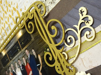
This is my second Scrapmatts DT layout reveal for July, using a family photo from my sister's wedding a few years ago. I wanted to go with a bit of a rustic feel due to the farm location of the wedding, with gold bling highlights because you can't go wrong with gold accents. ;)


The chain pieces (CB6109 Lamps 11 and CB1229 Chains 02) were all cover in chocolate embossing powder. I love the effect of the gold texture paste through the ST9006-A5 stencil in the background. I used 'Bling' from Colour Blast Australia and it just goes on so smoothly with a wonderfully thick coverage. My title comes from the CB6112 Scrap Words 31 pack. The flairs are from Accent Scrapbooking, who make the most amazing metallic flairs.


The new CB4069 Ornate Frames 26 set was perfect for my flourishes and stunning frame. I've embossed the frame with gold embossing powder but left the smaller background flourishes raw.


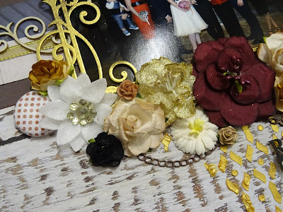
My flower cluster is a mix of quite a few different companies. Most of them come from D-lish Scraps because they have such an amazing range. I've also used some old Prima flowers and the black mini roses are from Kaisercraft. 


Tuesday, 4 July 2017

Baby Girl - Scrapmatts DT

I'm posting this one a day early for my Scrapmatts DT reveal, because it has actually already gone live over at CSI: Color, Stories, Inspiration. Don't be confused by the title and photo, I still have my darling son and haven't popped out a second baby. :) The baby in the photo is actually me and I still have that CareBear at my parent's house. It was the perfect colour scheme for the CSI challenge so I couldn't resist using it, even though now when I look at it I have all the warnings about never letting a baby sleep on a bean bag flash through my head. 


I had been wanting to use the gorgeous rocking horse chipboard piece (CB6057 Rocking Horses 01) for such a long time, so was very excited to finally get the chance. I have left the horse itself raw and painted the darker brown parts with a watercolour pencil, then used a gold pen to highlight the metallic details. The title comes from the CB5135 Baby Boy 01 set (or the baby Girl Set too). I have scattered words across from page from CB1191 Scrap Words 03.


I have used background stencil ST9006-A5 and painted Tinby Designs Color Crush powders mixed as a watercolour through it for a more subtle effect. My flourishes are actually from CB2003 Page Borders 02, but I've cut it into two quarter pieces to use either side of my photo.


If you're interested in playing along with the CSI challenge, the Case File is below and it's open all month. I'd love to see what you create. From the scene I was inspired by the thought of napping in a hammock on the weekend, so went with the napping photo. For my evidence I used text print, flowers, puffy stickers, wood and watercolour. My testimony using the inspiration words. I stayed fairly close to the sketch, just swapping the two top photos for a single one, and the circle photo for my horse chipboard.