Thursday, 17 May 2018

Is it my fault?

A quick art journal page I whipped up. This one has my musings on Mother's Day as the base layer, and then I've built up a range of stencils and freehand designs over the top of it.


While I like the end result, I think the purple was too dark to really capture the detail in the flowers.


I liked trying a new technique with my stencils. I painted patches of acrylic paint and then used a baby wipe to get rid of the colour from the open stencil areas. it kind of creates a reverse stencil impression. 


This image is just for me to upload to Instagram. 


Wednesday, 2 May 2018

Home Owners

I purchased an old Uniquely Creative kit a little while ago and split the contents with my mum. It works well because I do the layouts and she makes the cards. We've caught up for two crafting sessions so far and I've managed to only create one layout but it's still a lot of fun. :) 


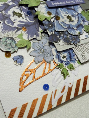
All this fussy cutting is why it's taken me so long to complete the layout! I like the end effect as there is quite a bit of depth to it but it was a bit tedious at the time. The kit contained two rolls of different rose gold washi tape which I just love.


I've included a combination of fussy cut elements, die-cut pieces from the Kaisercraft pack and sentiments made by Uniquely Creative to match the kit. Plus, the kit comes with a huge pack of sequins!


Wednesday, 25 April 2018

Beechmont

Whoa, what's this? Another layout just two days after the last one! I'm a little bit surprised myself but it's a public holiday here today and we've had family staying with us which has given me a bit of extra time to craft while they look after Harrison. The craft room is still not sorted or organised but I'm feeling much more relaxed for having had a chance to get messy. :)


I like the lopsided background on this one, with the layers of paper only down the left side. I've actually used the same Kaisercraft Christmas papers as in my 'First Cuddle' layout from earlier in this month, but the end effect is such a different type of layout.


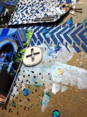
I continued the background techniques onto some scrap craft paper and created two tags to add some extra layers. The bottom tag is taped down but the top one has my journaling hidden on the reverse. 


I've used some art journal techniques again on this layout to build up some depth in the background, including three different stamps and some hand-drawn plus signs. I LOVE this crosses washi tape, it is just so versatile. I also couldn't go past adding some Scrapmatts Word Art pieces.


My layouts just don't seem finished unless I've added some sequins these days. :) Sequins and the very cool wood veneer shapes are from D-lish Scraps


This layout was created for the April Kraft+ challenge. Something old: Kaisercraft patterned papers and the photos, which are from 2013. Something new: two Kaisercraft stamps, I've had them for a while but this was the first time I've used either of them. Something borrowed: I've scraplifted this layout by Georgia Heald. Something blue: the church, the ink splatters, the stenciling, the sequins.


Tuesday, 24 April 2018

East Shores, Gladstone

I couldn't decide between creating an art journal page or a scrapbooking layout, so decided to combine the two and go with a layout with an art journal type background. I like the result and think this is worth experimenting with further.


The background started with a wash of two blue Gelatos. I applied some colour acrylic paints through stencils and white gesso over the top of it all for some more texture. A bit of tissue pattern, builders tape and ribbon formed the middle layers.


Kaisercraft die-cuts and an Accent Scrapbooking flair form the main cluster. Enamel dots and washi tape accents from D-lish Scraps. 


This crocodile was the start of the whole layout and I love how cute he is! The photo mat is built up of a couple of different pieces of scrap papers because I'm trying to slowly work my way through the lifetime supply of paper I have.


We went to visit my parents for a long weekend and they took us to East Shores Precinct. Harrison had the time of his life! Looking through the photos again makes me think I might need to scrapbook a few more of these. 


This layout was inspired by the April challenge over at CSI: Color, Stories, Inspiration. They have simplified the rules recently, so if you've been thinking of playing in the past but held back, now is the time to join in!

I couldn't go past this cute lama image. It reminded me of the die-cut animals I had from Kaisercraft, which lead to the crocodile which reminded me of Harrison's swimmers. I took the rest of my inspiration from the colour scheme. 


Wednesday, 11 April 2018

First Cuddle

After getting SO messy on my last art journal page, I actually just wanted to create a quick and clean layout. I thought the easiest way to do this would be to grab a D-lish Scraps Just-Add-Paper kit and was so right: all I had to add was some Kaisercraft paper.


The inking ended up messier than I'd anticipated due to using an old ink pad that had stored the ink oddly, but I decided to just go with it. Since it was already a little messy, I couldn't help but add some gesso through the stencil that came with the kit. I love a white-on-white background for a subtle effect. 


This layout was created for the Scrap The Boys challenge for April which is 'Let's Go Geo'. I used rectangles for my background paper shapes and stars as my feature embellishment shape.

April Challenge - ends April 30

Wednesday, 4 April 2018

Take a Leap - Art Journal Page

I'd had one of those days where I just needed to relieve some stress so I wanted to crack open the paints and get messy. I didn't have a plan or project in mind, but I remembered I hadn't tried Leanne Jago's Soul Starter prompt from the Soul Journey 2018 facebook group I'm part of. After taking one of Leanne's classes in person a while ago I knew it would be just what I needed and it worked a treat!


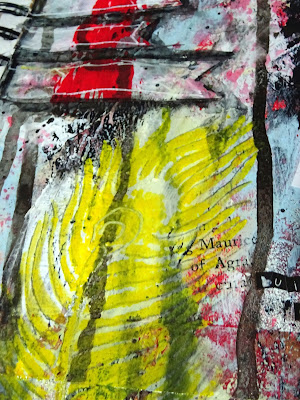
I changed the quote for the page, because I only had a feather stencil to work with as my main image on the page. I liked this one, as to me it's about not overthinking things and just getting out there and giving life a go. The quote I found on Pinterest said 'build your wings on the way down' but I thought if I've got wings why am I going down when I could soar?


I think I need to work on letting some more of the layers continue to show through. You can barely see the paper doilies and book page strips from the bottom layer.


Tuesday, 3 April 2018

Happy Birthday Watercolour Card

Just popping in with a quick birthday card I whipped up yesterday. The background and flowers were actually done during a Natalie May class at a scrapbooking expo but I never got around to finishing them off. I fussy cut the flowers, added the white highlights, a black pen border to the background and created the sentiment cluster.


Close up of the flowers to show the layered heights.


Friday, 30 March 2018

Peace, Love and Pineapples - Fluttyby Designs Guest DT

Here is my second guest design team reveal for Flutterby Designs. I've picked the pineapple themed pieces out of the Good Vibes Only release for this one, because they were just perfect for these photos of our visit to The Big Pineapple on the Sunshine Coast in Queensland, Australia.


This card from the Everyday Etc. Photo Cards pack was my inspiration for the whole layout. I loved it as soon as a I saw it. The white space in the top left was perfect for adding a couple of extra embellishments. I've used a circle from a Kaisercraft paper pad and changed the quote from 'enjoy the little things' to 'enjoy the BIG things', plus a splatter of green ink to tie it into the background.


My main embellishment cluster has a page tab and flair from the Good Vibes only range, as well as a fussy cut pineapple from the Everyday Etc. Filler Photo Cards pack. I've used two other cards from that pack to create my photo mat. The beautiful die-cut is from Couture Creations.


Up in the top cluster I've used some off-cuts of the blue from the photo mat plus a sentiment from the Sticky Quick Quotes sheet. The flair is from Accent scrapbooking.


This layout gave me so much grief because it ALMOST worked but then just didn't no matter what I tried. This was my first attempt, below. What should have been a vibrant blue to match the photo mat ended up being a teal that just looked out of place.


This led me to HANDPAINT all the drips again to turn them green. I added a couple more embellishments but then decided it was overworked. Plus, as much as I loved the colours of the big photo mat at the top, it just didn't work with the layout. 


Tuesday, 27 March 2018

Barefeet Welcome

Here we have my fourth project from the Workshop Wonders class I attended at The Crafty Chain. This is probably the one I free-styled the most on, possibly because it was the last class of the day and I finished a lot of it at home. 

I'm not normally a fan of these off-set border type layouts, but I think having the paint splatters go across the whole page has made it a bit more cohesive. 


In this class we used a Vaseline-smeared stamp to create a background resist which we then highlighted using Shimmer cubes. It's not a technique I'd used before so it was interesting to try something new. 


My die-cut border has some extra Scrapmatts chipboard fitted in because I have a stockpile of them. :) I loved the effect of knotting the twine from the anchor.


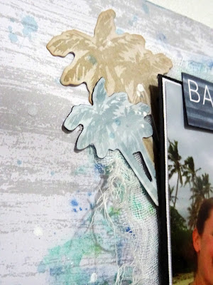
I also popped some white muslin behind my photo matt, just to soften the overall effect.


This is the teacher's example.


Friday, 23 March 2018

Be Fearless Canvas

The third Workshop Wonders class was one I was really looking forward to doing, as it was a canvas taught by Leanne Jago. Leanne does amazing mixed media pieces and it was great to be exposed to her techniques to build up a range of different layers and textures. Unfortunately, her expected materials hadn't arrived in time for the class so we all had to improvise a bit with substitute products.


I'm not sure Leanne would entirely approved of the fact I've added some bling to the butterflies but I couldn't help myself. I just love adding sparkle to projects and I had these left over from the first class. :) This detail shot also shows off the aquarelle pencil for all that watercolour-black effect and some great bits of crackle texture. 


I'm normally not a bit fan of using vintage images in my work but when I saw this girl in my kit with her smug smile and hand on her gun I just had to use her. I thought her attitude went perfectly with the Flutterby Designs sticker sentiments. I also killed my brand new Posca pen trying to outline the girl to make her stand out, only to decide the effect was too subtle and used white gesso instead. 


This shows the multiple layers: gesso base/crackle medium/acrylic paint/white embossing powder applied to glue through a stencil/brown ink drizzles/acrylic paint smudged on with fingers/stamping/mist splatters.


This was Leanne's sample piece. You can see that I've stuck very close to her design but gotten quite a different finished product just with some different paint colours. 


Wednesday, 21 March 2018

A Day in the Sunshine

This was class two from The Crafty Chain's Workshop Wonders event, taught by Geli Duncan. I've used photos from a trip to Tropical Fruit World I took with my sister and son in August 2017. They worked with the colour scheme of the class so well and I liked being prompted to use different photo sizes to what I would normally.  


See this beautiful blue flower below? Geli taught us how to make that from scratch using plain white foamirian. Given I already have a literal huge drawer of flowers I don't think I'll be making my own anytime soon but it's always fun to learn something new.


The beautiful due is by Couture Creations and we each got a brand new included in the class kit. The background technique was a fun one to learn as well, though as is often the case for me I didn't extend it far enough past my photos. It's made on Kaisercraft specialty embossed paper using Twinkling H20's and baby wipes to create a beautifully soft blended effect. 


Below is Geli's samply layout. I stuck with something pretty similar, just changing the composition to match the different photo sizes I had. 


Monday, 19 March 2018

Anything is Possible

I was craving some crafting time over the weekend but my new scrap room isn't set up yet. Luckily, I had signed up for the Workshop Wonders event being held at The Crafty Chain! Four classes with four different teaches over the course of a day, it also included lunch, snacks and a lolly bar.


This was the first layout, by Kelly-ann Oosterbeek. It has a LOT of fussy cutting. I tried something different for me and left more of a border around the image so I could cut faster. Having an 'edge' normally annoys me, but it worked into the background on this layout. 


The beautiful butterfly stickers are made by Kelly-ann herself. I should have picked up a couple of packets but I couldn't work out what shade I wanted. I learnt a nifty trick, that if you want the wings to stay popped up you just place a pearl/rhinestone underneath.


Looking at the layout now I almost wish I had purchased a second sheet of the wreath paper, so I could fussy cut out a few more flowers and raise them up. I'm still undecided if I will add some more to this one or not.
Anyway, below is what Kelly-ann's version looked like. You can see I really didn't move too far from the sample here. I think I was too tired after all the cutting. :)